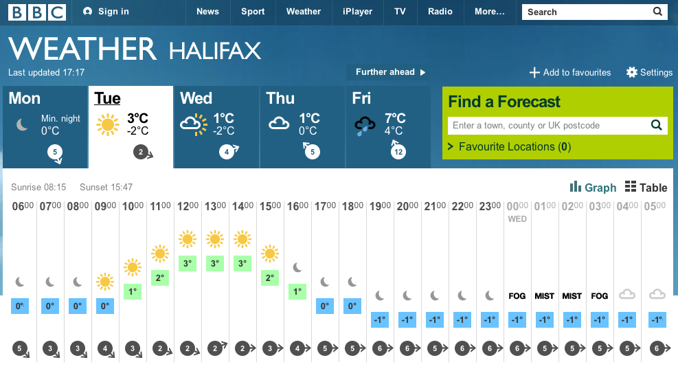
What a lovely use of infographic design and visual referencing here by the BBC. Small user interaction details such as raising the sun as the temperature increases is subtle and makes for a much improved user experience. Designing information in this way improves our understanding of it which in turn aids retention.
It is details like this within digital design that if applied to wider businesses and brands would improve conversions, customer satisfaction, engagement, NPS scores along with a whole host of other potential metrics.
Think about the application of this type of design in your next monthly report – wouldn’t a single page infographic like this do more than boring excel bar charts to help you present your case and win backing?
What if phone companies displayed their data usage levels like this or your bank displayed your spending habits in this way or your car dashboard showed your speed rising and falling and the potential impact that has on petrol consumption – I am sure such subtle adaptations of the everyday things we interact with could bring about more positive changes in our lives.

Leave a comment